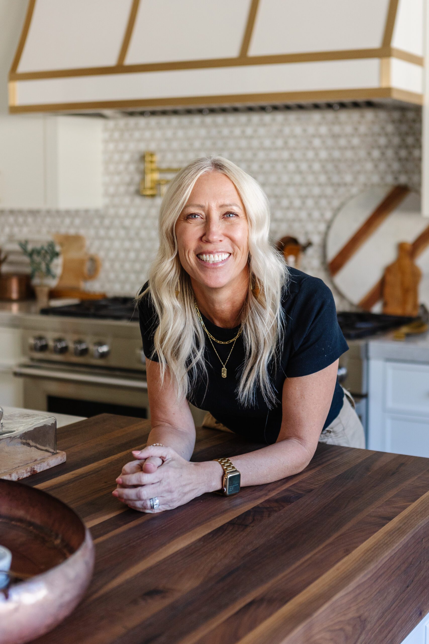
I am so excited to share this fabulous house that I just received the pictures back on. Meet the Notre Belle Maison.
When I begin the designs for a new home, the first step is to come up with a game plan… and at this stage, it is important to decide what the “theme” of the home will be. A theme doesn’t mean everything in the home will be matchy, matchy or exactly the same, but a theme is there to help bring everything together in a complementary way. I want to achieve a cohesive feel. As I worked on this home I wanted to bring elements into each space that are similar but also, very subtle. With this amazing home, the theme I wanted to create was a French Chateau feel.
Design Elements
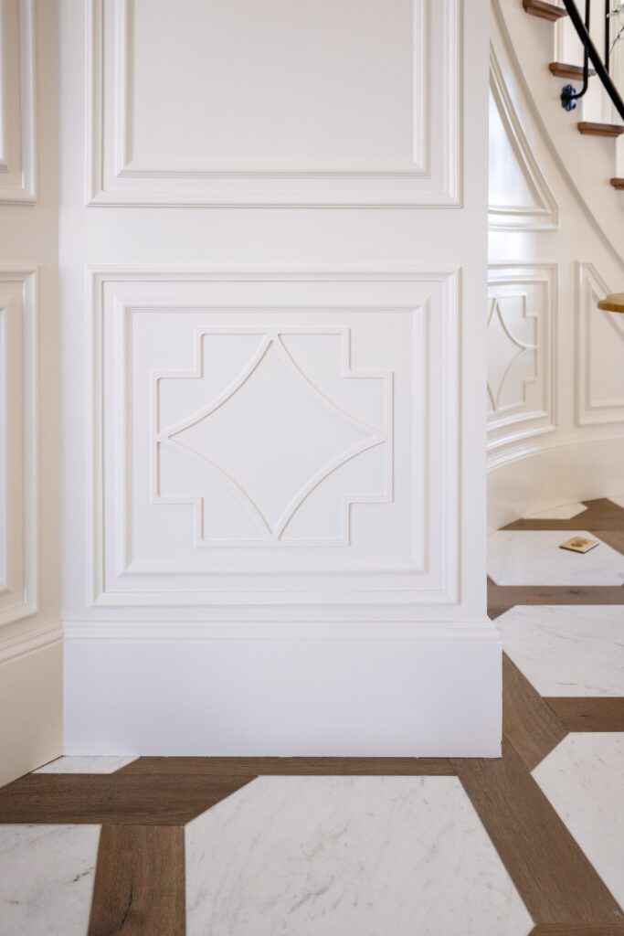
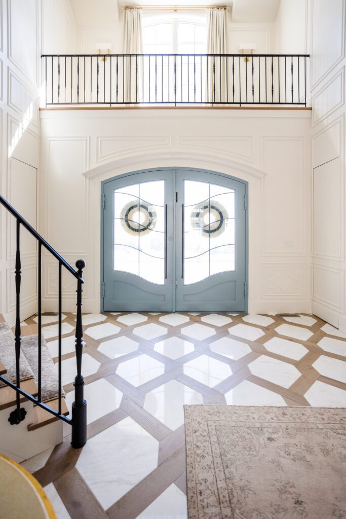
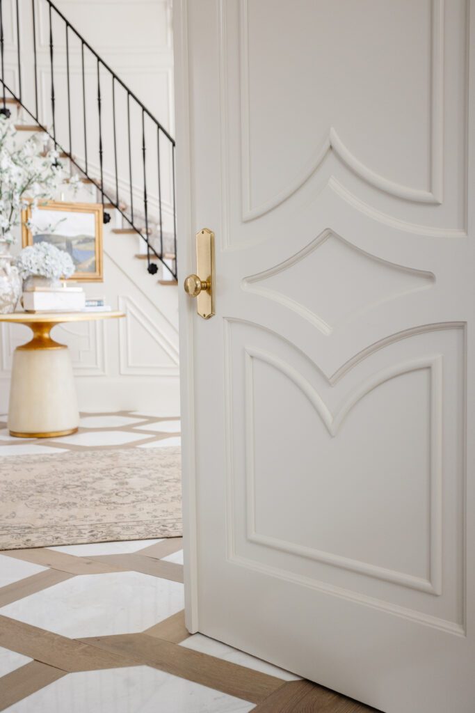
The first element that you will see in many different spaces of this home begins in the entryway. Notice the clipped diamond pattern on the floor with the wood and marble. Then the softened and slightly curved diamonds that I incorporated into the walls in the same space. The library doors incorporate a slightly shorter and curved diamond, maintaining the element in the space without duplicating it. This element is found throughout the home.
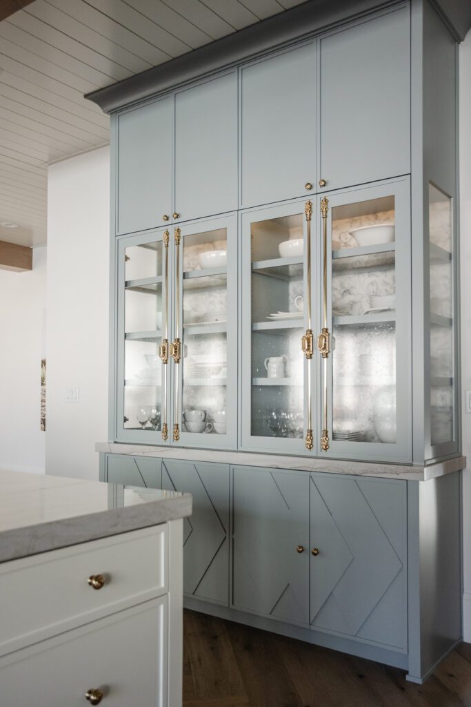
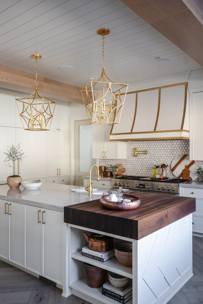
I brought it into the kitchen as well, on the swinging pantry doors, the cabinet under the sink, and the hutch. In this space though, I straightened the lines and elongated the diamonds. It’s elements like this that really bring that cohesive feel. It doesn’t look like I randomly placed matching diamonds everywhere but subtly they exist in so many different places.
As a reminder, if you want to include elements like this, it’s important that you have skilled craftsmen creating these beautiful pieces. If you want quality work done, it does matter who you bring in. You can learn all about this in our blog post “My Top 5’s When Building A Home”
Paint
The next element I used to bring the cohesive feel was the paint. You may want to keep the same paint color theme throughout the home. Keep it separated by space, and necessity, so it doesn’t overwhelm the eye. In this home, I utilized the color Silver Mink by Benjamin Moore. This is a beautiful silvery blue color. It lended to both the feminine side of some spaces, as well as the masculine needs of others. You will notice, as I continue to post pictures of this home on my instagram, where this color is incorporated. Here are some areas I want to highlight where this color is used.
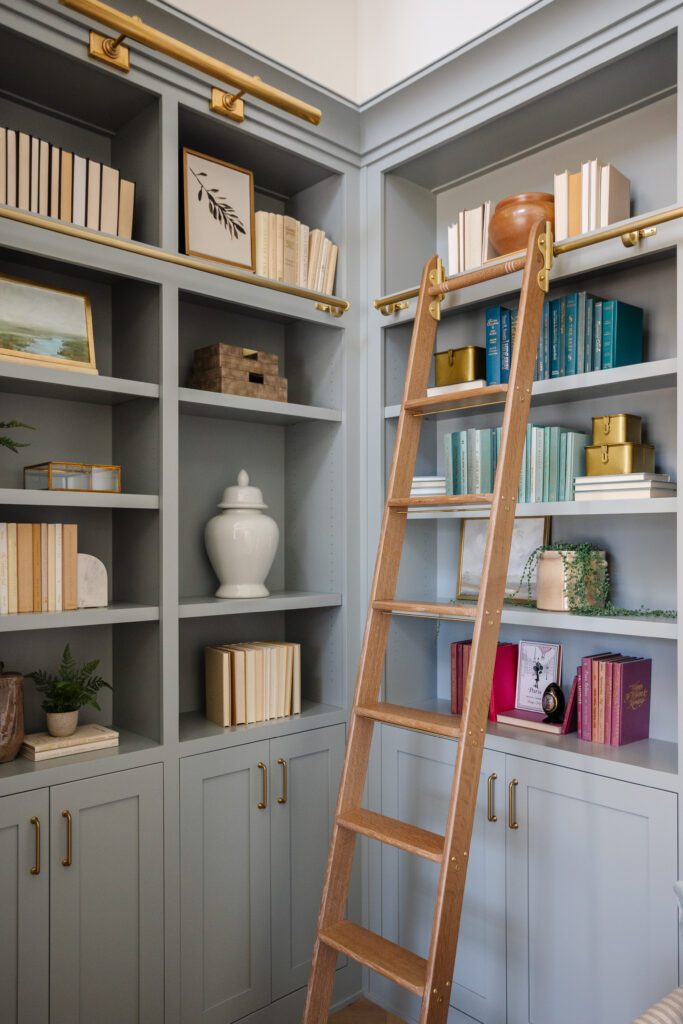
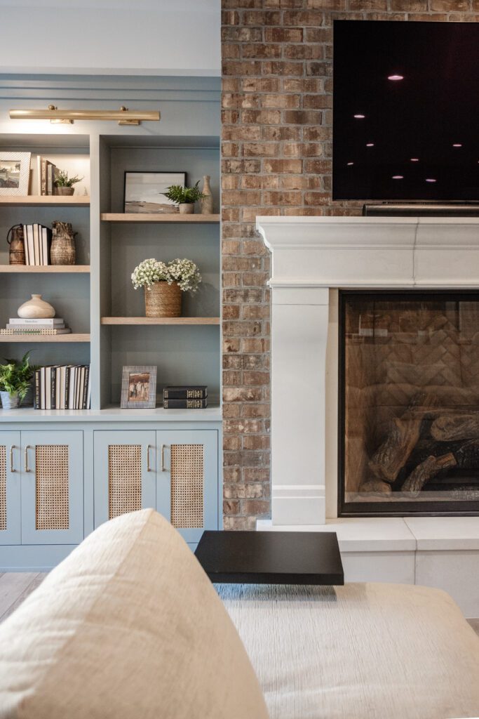
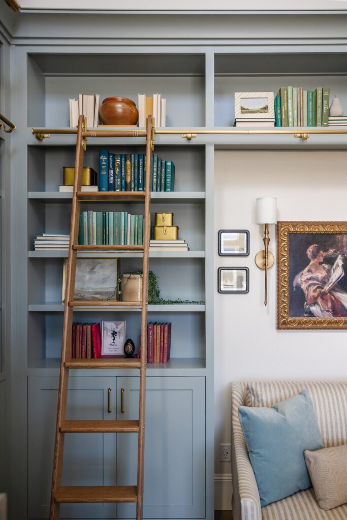
This amazing color is used on the hutch in the kitchen. The rest of the cabinets are the color of the walls (Swiss Coffee) but I really wanted this piece to stand out. The color is also in the Butler’s pantry. THROUGHOUT 🙂. The Silver Mink color is also in the library on the cabinetry. Since the mantel was a richer color and the furniture in this area was very neutral, I knew it wouldn’t overpower the space. Lastly, in the lower level family room I brought in the same Silver Mink color in to help ground the space and bring in a moodier feel, it was a great contrast to the used brick. There is so much you can do with color. It’s amazing how you can bring the same color into so many different spaces and have it be so different in each place.
When I design homes like this, it can be easy to start going crazy with decor, furniture and lighting. Of course, I want it to be amazing… BUT, I don’t want all of this to outshine all the other elements of the home.
Lighting
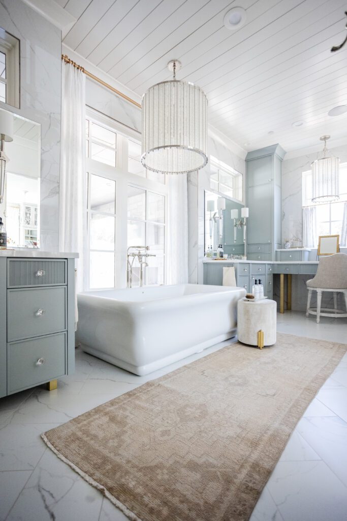
I choose to do more large scale lighting all while keeping it tasteful. This keeps the lighting balanced with the rest of the home. There was one exception to this in the primary bathroom. I brought in a beautiful Chandelier, I wanted to add this dramatic element above the tub.
In the Kitchen, I found some beautiful pendants. They continued our diamond theme but in an incredibly similar way to the front entry wall designs. It boasted the same curves and softness…yet they were not in our minds when I designed the entry walls. It’s always amazing when we find things like this during the design process, it cements the fact that this was the right choice for the home.
Furniture & Decor
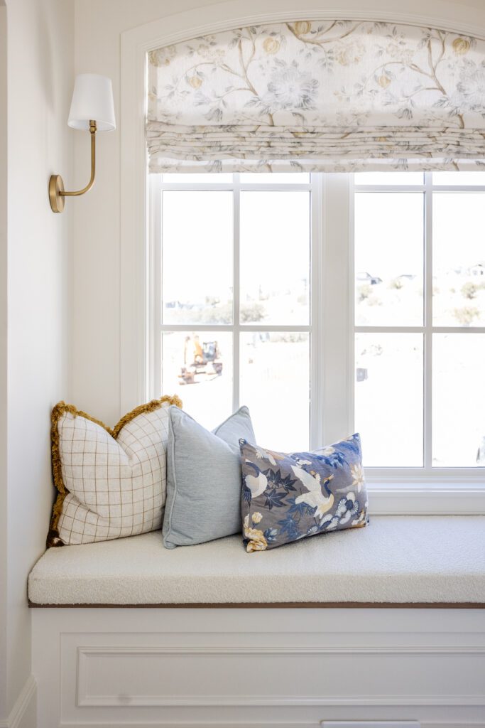
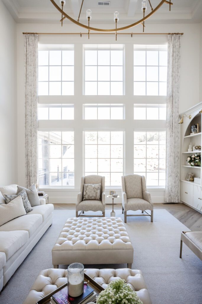
The furniture in this home is very neutral and soft. To complement this, I brought in pillows to add style and color into the spaces. Be sure to check out the Sewing Nerd for all your pillow needs.
I use this same concept for the draperies. I wanted them to create softness and grandeur in the home, and accentuate the simpler color palette I used throughout. It was Important that they didn’t stand out, or blend in so well they disappeared. Uptown Drapes made this a reality for the home, their work never disappoints!
Lastly, back in the Library, since our cabinets were the Silver Mink color, I didn’t necessarily want to draw the eye to one particular thing. If there are too many colors, or only use neutral decor, you can use decor to offset. In order to combat this in the library, I color blocked the books. The lighter color books were together and the bolder books together. This allowed us to incorporate the colors, but not have them be distracting.
This home was so fun to design and get to see it brought to life. I spent years working with this homeowner to get to understand their wants and needs for the home. I brought in only the best of the best to ensure that not only would our designs be executed perfectly, but that our clients would FEEL taken care of. This Is the experience I want every client to have with they work with us.
I appreciate you taking the journey into this home with us and I hope you have enjoyed the pictures!
Hugs,
Alli